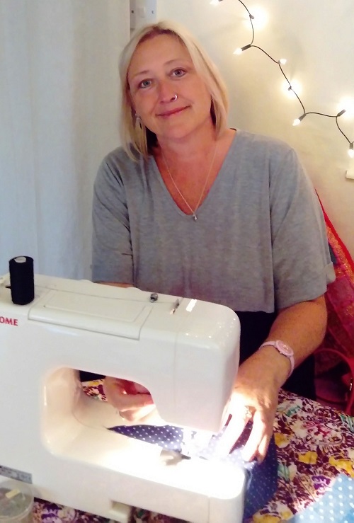
I had a vision of what I wanted it to look like but, to make it work, I needed the help of an installation artist. I found Claire Johnson: thanks to Claire’s gentle manner and general loveliness, we worked together really well.

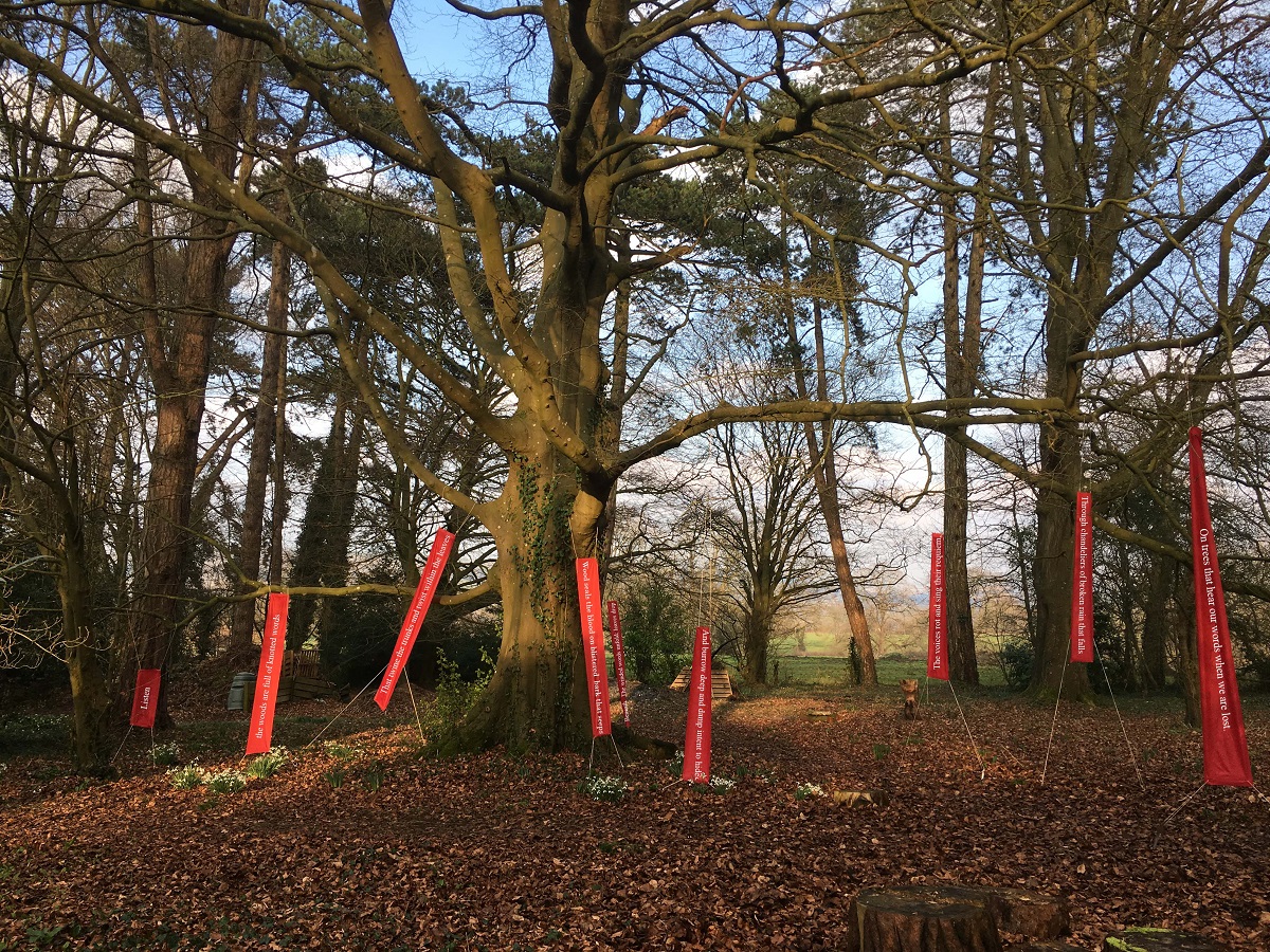
I wanted my poems on red banners, hanging beneath the canopy of the trees. Red, for me, was instinctive. I knew it would stand apart yet blend with nature. I researched other artists working in nature and found red was often featured.
To be approved by Westonbirt, the banners needed to be:
- Easily visible (to reduce footfall around tree roots)
- In trees of appropriate height and where the base won’t be at risk
- Consistent with Westonbirt branding
- Away from trees professionally photographed in Autumn.
We used ripstop material, already used at Westonbirt. It is lightweight, durable and inexpensive.
We found red worked well and vertical hanging looked more natural than horizontal hanging. We did a mock-up on a beech tree in my dad’s garden.
I found that each tree at the arboretum needed different banner widths and font size, depending on trunk width and distance from the path.
I first thought black font would work well on the red banners but I was wrong; the contrast was too subtle, so we went for white.
Getting the right font was crucial; Outside Studios (who work with Westonbirt) advised me to use Baskerville font. It is very legible and was first used when Westonbirt opened (1829). It is important that my poetry is easily seen so I trialled the banners with arboretum visitors.


